


moody | complex | vibrant | dramatic | cinematic
Buy The Collection and Save 30%!
Our Color Grades Will Help You...
Discover New Artistic Horizons
Color is a powerful tool to convey emotion and tell a story, regardless of your genre. However, it can take time to figure out where to start. Our thoughtfully selected color grades will open the doors of possibility for your images and move you in new, exciting directions.
Save Time and Focus on Your Art
Enhance your images with captivating and unique color tones full of narrative depth without getting bogged down in menus and sliders. You can apply a complete color grade with just one click and immediately begin customizing it to your taste.
Support the Artists You Love
Create with confidence, knowing our color grades are created by working artists and held to the highest professional standards. Not only are they thoughtful and nuanced in execution, but they are also technically robust.
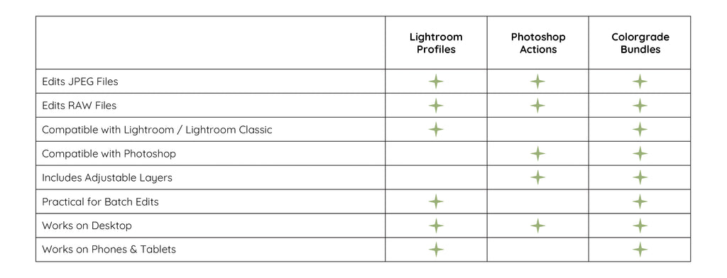
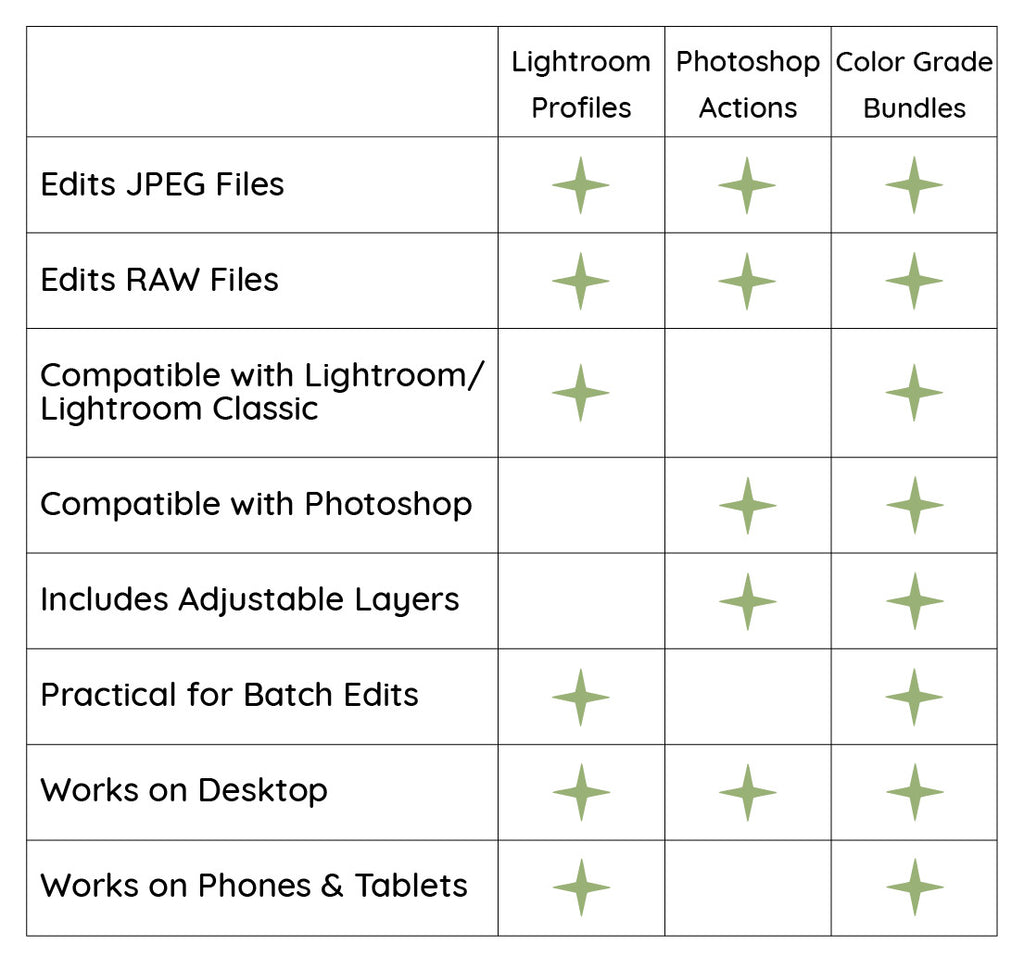
Which File Type is Right for You?
Explore the collection...
Create a complete visual narrative with these curated actions
﹀


NO. 1
warm-toned | high-contrast | painterly | subdued yellows
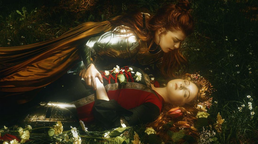
Reawaken your imagination and experience the transformative power of Renaissance. Neutral hues dance with warm midtones and wildberry reds as your photos are imbued with a warmth and vitality that invites you to delve deeper into its expressive potential.


NO. 2
warm-toned | soft | deep colors | sunrise-inspired
Venture as far as you dare into the fiery heart of Inferno. Whether you want to permeate your images with a gentle sunrise’s soft, subtle hues or ignite them with the fierce, vibrant tones of the phoenix, the only thing holding you back is your ability to stand the heat.


NO. 3
rich | deep | dramatic | jewel tones | split-toned
Stroll through The Garden of Paradise, where your images are steeped in a beautiful, seductive color palette inspired by a rich tapestry of moonlit wildflowers with delicately balanced warm and cool tones.


NO. 4
cool-toned | desaturated | neutral | deep | soft
Embrace the cold, pale nature of Apparition and open a portal into a world where colors are muted and dreamlike. A palette of soft grays and neutrals glides over your images, subduing tones and imbuing them with a sense of mystery and otherworldliness.


NO. 5
desaturated | neutral | metallic | bright reds | high-contrast
Hold tight and enter a mysterious, beast-filled forest with Wolf in the Woods. Cautiously venture deeper and discover soft, neutral grays lurking among the shadows and unnaturally bright, vibrant reds. Howls echo in the distance as you notice your images begin to change into something more sinister.


NO. 6
vibrant | high-contrast | saturated | bright | rich
Infuse your images with the glamor and romance of a bygone era with Golden Age. Bright, saturated tones full of warmth and contrast intermingle, imparting a color palette alight with a vibrant energy that breathes new life into any photograph.