


cinematic | painterly | evocative | rich | vibrant
Buy The Collection and Save 33%!
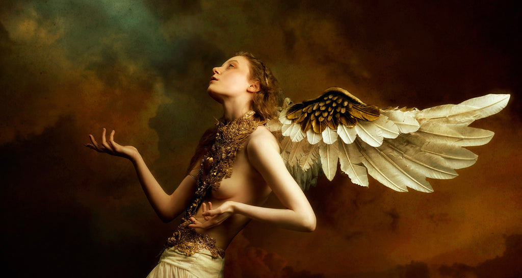
Infuse your photos with timeless beauty and artisanal charm using color palettes inspired by the seminal masterpieces of famous painters. The Fine Art Collection invites you to dive into the realm of cool, sparkling lilacs inspired by Monet's mesmerizing Waterlilies paintings, experience the richness of warm, layered colors reminiscent of Da Vinci's iconic Mona Lisa, and immerse your images in an evocative palette inspired by the timeless artistry of Botticelli's Venus with carefully crafted actions that pay homage to the art that sparked their creation and the images they gracefully transform.
Explore the collection...
Create a complete visual narrative with these curated actions
﹀


NO. 1
warm | soft | neutral | filmlike | painterly
Botticelli's Dream releases like a warm summer breeze across your images, rich in tone and soft in nature. Delicate hues of seafoam greens and gentle blues harmonize with the warm earthy tones found within Botticelli's "The Birth of Venus," while any red hues remain preserved.


NO. 2
bright | purple | ethereal | pastel | cool
Monet's Moonlight evokes an ethereal and mesmerizing atmosphere with an enchanting blend of cool pastel colors. Twilight hues of blues and lilacs gracefully spread across the midtones, leaving behind gentle and delicate highlights.


NO. 3
vibrant | warm | rich | enhanced contrast | lush
Masterfully enhance your image's tones through a gentle, almost indistinct blending of shades and hues with Da Vinci's Discovery. Colors subtly transition from light to dark, embuing your subject's skin with an ethereal glow, almost as if they were illuminated from within.


NO. 4
cool | twilight | vibrant | mystical | pairs well with dark tones
Gracefully intermingle dreams and reality with Starry Night. Intense ultramarines and cobalt blues harmonize with Indian yellows that accentuate skin tones, all juxtaposed against deep greens lurking within the shadows creating a palette that pairs best with images with darker tones or backgrounds.


NO. 5
cinematic | filmlike | green hues | warm | vibrant
Build a scene both serene and enigmatic with Hopper's Harmony. Blues and greens subtly linger in the shadows while softly revealing themselves in the highlights. Midtones retain the warmth reminiscent of the cozy interior of the diner depicted in Edward Hopper's "Nighthawks," forming a color grade that pairs best with images with darker tones or backgrounds.


NO. 6
ethereal | delicate | pastel | cool | whimsical
Delve into the ethereal lilacs and gentle blues of Georgia O'Keeffe's "Music, Pink and Blue No. 2" with O'Keefe's Enigma. The color palette evokes a sense of tranquility and elegantly subdues any presence of yellows, leaving behind delicate pastel hues particularly well-suited for images with lighter backgrounds.
Our Color Grades Will Help You...
Discover New Artistic Horizons
Color is a powerful tool to convey emotion and tell a story, regardless of your genre. However, it can take time to figure out where to start. Our thoughtfully selected color grades will open the doors of possibility for your images and move you in new, exciting directions.
Save Time and Focus on Your Art
Enhance your images with captivating and unique color tones full of narrative depth without getting bogged down in menus and sliders. You can apply a complete color grade with just one click and immediately begin customizing it to your taste.
Support the Artists You Love
Create with confidence, knowing our color grades are created by working artists and held to the highest professional standards. Not only are they thoughtful and nuanced in execution, but they are also technically robust.
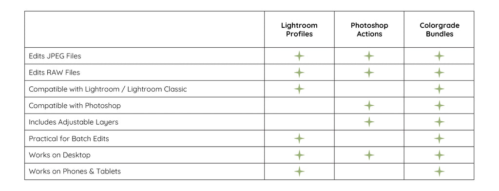
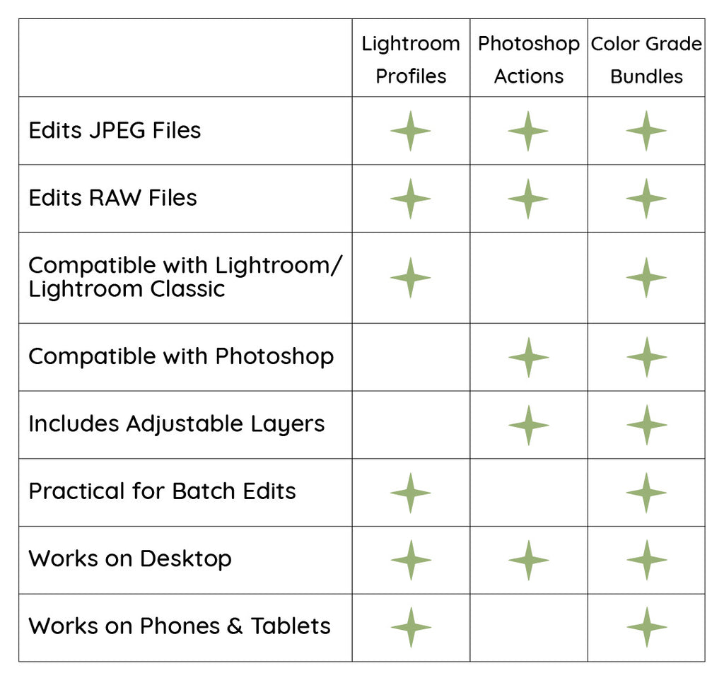
Which File Type is Right for You?