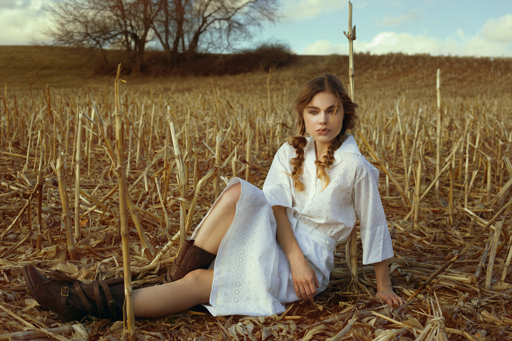


moody | cinematic | evocative | natural | film-like | muted
Buy The Collection and Save 30%!
Immerse yourself in Kate Woodman's artistry and style with The Cinematic Collection. Inspired by the vital role color plays in cinematography, the collection features sophisticated palettes that enhance your photos' storytelling elements. Whether you want to elicit the nostalgic feel of a classic film or prefer something more Avant-guard, Kate has created an intoxicating selection of color grades driven to evoke mood and emotion.
Our Color Grades Will Help You...
Discover New Artistic Horizons
Color is a powerful tool to convey emotion and tell a story, regardless of your genre. However, it can take time to figure out where to start. Our thoughtfully selected color grades will open the doors of possibility for your images and move you in new, exciting directions.
Save Time and Focus on Your Art
Enhance your images with captivating and unique color tones full of narrative depth without getting bogged down in menus and sliders. You can apply a complete color grade with just one click and immediately begin customizing it to your taste.
Support the Artists You Love
Create with confidence, knowing our color grades are created by working artists and held to the highest professional standards. Not only are they thoughtful and nuanced in execution, but they are also technically robust.
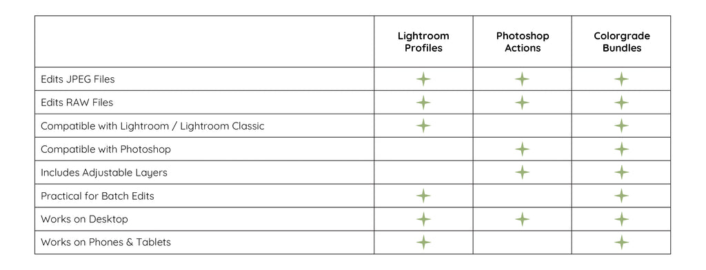
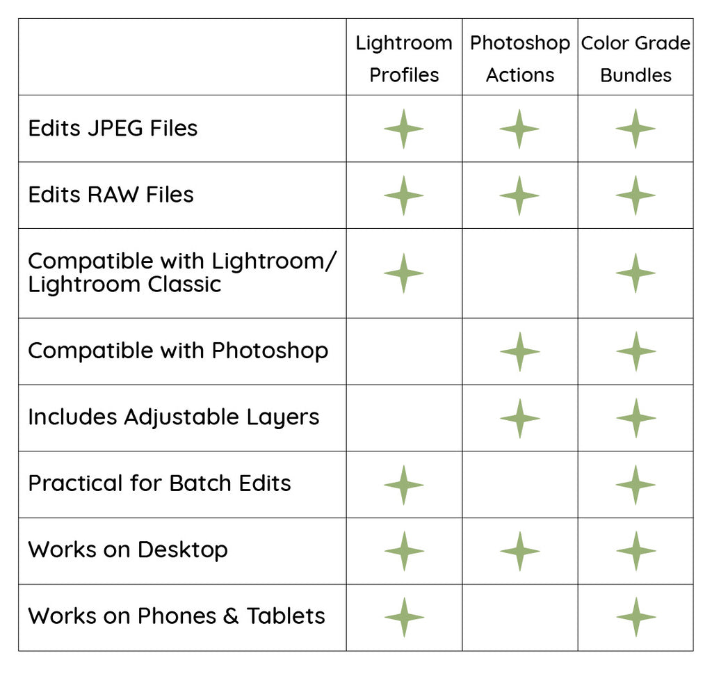
Which File Type is Right for You?
Explore the collection...
Create a complete visual narrative with these curated actions
﹀


NO. 1
warm | film-like | soft orange tint | evocative | natural
The warmth and radiance of a summer's day are vividly depicted in the luscious, film-like hues of Orange Dahlia. Soft highlights and rich, natural tones blend together to create vibrant and lifelike imagery, imbuing each frame with a cinematic charm that captures the season's essence.


NO. 2
purple-hued | expressive | split-toned | cool/warm | film-like
Weave a rich and vibrant tapestry of color that is both evocative and alluring with La Vie En Rose. Within this lively action, a poetic and romantic interplay of tones is accentuated by delicate blue highlights, sun-kissed midtones, and deep, rich purples and violets that embrace the shadows.


NO. 3
muted | warm | nostalgic | vintage | melancholy
Nostalgia transports you back in time with melancholic, vintage-inspired tones. The action subdues highlights and enhances the warm, rich depth of the colors, creating a moody and evocative atmosphere that is both wistful and deeply impactful.


NO. 4
rich | vibrant | summery | warm | sunset-like
Dance on the cusp between seasons with Golden Harvest. This evocative action combines the last of summer's heat with fall's vibrant, intense hues, creating a palette bursting with sunset warmth and rich, autumnal tones.


NO. 5
cool-toned | intense | blue/teal | intriguing | expressive
Vibrant and vivacious, Femme Fatale celebrates the expressive potential of cool, captivating blues and teals. These bold, striking hues are enhanced and explored, creating a dynamic and evocative visual experience sure to catch the eye.


NO. 6
desaturated | cool-toned | high-contrast | haunting
If Cruella doesn't scare you, no evil thing will. A haunting and intriguing blend of desaturated, ghostly tones and warm, vibrant midtones, this action exudes a sense of mystery and drama. The effect is especially impactful when applied to images rich in yellow and red hues.