Photographers have been color toning from the moment it became an option. There’s something quite magical about seeing your images come to life through color, and when done right sometimes the experience of the photograph can feel more tangible than the actual moment itself.
Whenever I come across an artist sharing a before-and-after image, there's almost always a comment along the lines of "I preferred the before." Now, personal taste is subjective, and that's completely fine, however, many photographers do opt to enhance their images through color toning and we should remember that it can be daunting to share your work after spending lots of time considering exactly which color direction to take it to.

For some, it's as straightforward as adjusting exposure, highlights, and shadows.
Others might rely on a couple of presets for a quick, efficient transformation that captures their desired vibe.
Then there are those who embark on a more intricate journey, delving into the intricacies of layering multiple adjustments to bring forth a specific vision.

So, why do we color tone?
I personally believe there's no definitive right or wrong way to color tone. The use of color, or even the intentional absence of it, is a potent tool in our creative arsenal. It allows us to efficiently and effectively convey distinct feelings or moods in an image. It can transport us to time gone past, or into artificial, futuristic visions.
Color toning is a powerful storytelling element cultivated for years by many great artists in the pursuit of mastery.

While there's a multitude of ways I can expand on this topic, let's focus on two ways we can use color to enhance our vision.
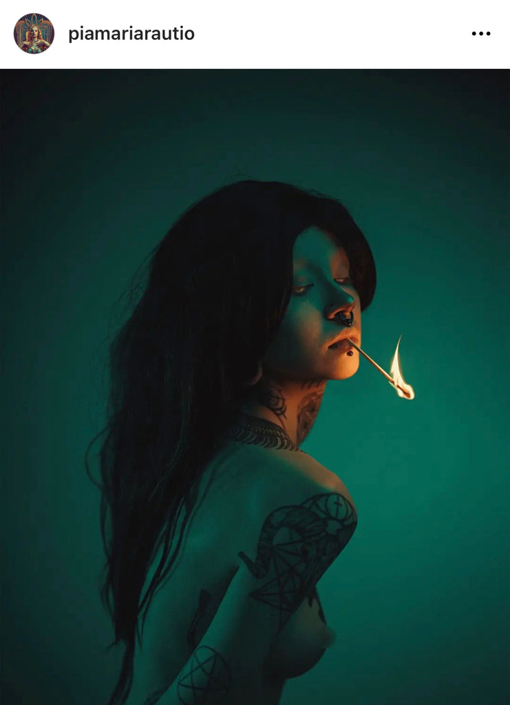
Utilizing Color Psychology ~
Scientifically, color profoundly influences how we perceive the world. It has the power to evoke emotions ranging from calmness to agitation, aggression to peace, and a myriad of others. Through color grading and/or strategic lighting, we can create specific moods. Warm-toned imagery, for instance, enhances cozy, wholesome vibes, while darker, muted palettes elevate cooler, more sinister aesthetics.
Understanding these basic principles can inform the decisions you make in your imagery.
If you're uncertain about the ideal color palette for your images, consider this creative exercise: build a moldboard.
Collect images that align with your concept and observe the color palette emerging from your consciously (or sometimes unconsciously) selected visuals. This process can be enlightening and guide your creative choices moving forward.


final pictures
Connecting Colors
I first noticed connecting colors while looking at paintings in museums.
The art of connecting colors has a rich history, and exploring paintings in museums provides a fascinating glimpse into the thoughtful choices artists made with the limited palette options available to them. In those times, artists had to be incredibly deliberate about the placement of tones, considering not only the aesthetic appeal but also the profound impact on overall viewability.
The constrained color choices prompted artists to focus on the subtleties of hue, making each shade play a vital role in the composition. This careful consideration wasn't just for aesthetics; it often served symbolic purposes, especially in religious imagery. Colors became a language in themselves, conveying nuanced meanings and contributing to the narrative depth of the artwork.

Self-portrait, Vincent van Gogh, 1887
So how can we include this ethos in our art?
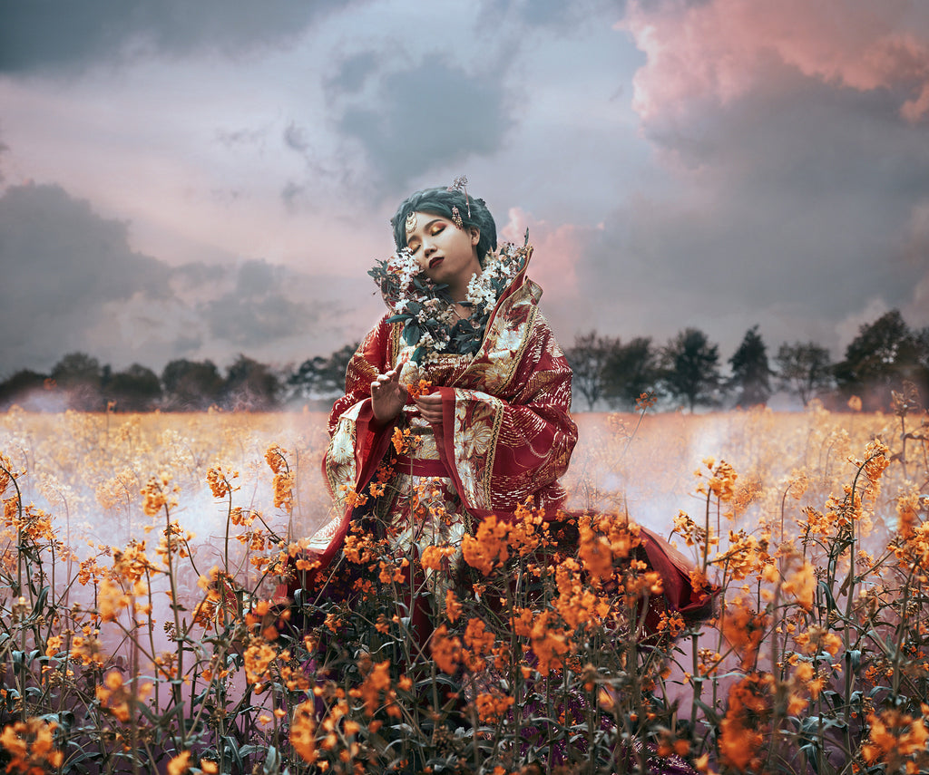
In my approach to photoshoots, the journey begins with considering the color palette. It's not just about capturing an image, it's about weaving a visual tale.
I ask myself, what story do I want to tell, and which colors will best serve the overall concept and visual impact?
How does the styling work on my model or client?
What colors might create connections in the overall scene?
For example, taking into account the color of their eyes or hair, might inform the choice of dress, props, or backdrop that we use.
If I’m constrained to shooting against a particular backdrop, say for example, if we’re shooting with purple flowers that day, then how can I add another element in the picture that is also purple, creating a color connection between my subject and the background.

This meticulous curation isn't just for the sake of the lens; it's a deliberate translation of emotion and intention. What the viewer experiences is not just a photograph but a harmonious composition where every color has a purpose, and every shade contributes to the resonant story I set out to tell.
For your next photoshoot I invite you to consider implementing the concepts of color psychology and connecting colors!
I’d love to see what you create so please do share your imagery with us in our Facebook group and Instagram (#onlythecuriousco)